FAQ Q279: Will planyo work with responsive (mobile-first) sites using Bootstrap or another framework?
Section: Integration with my website
Yes, planyo supports responsive, mobile-first design, and will generate responsive code. By default, however, planyo is not configured to be responsive. Instead, the default planyo scheme has 2 different sets of stylesheets and templates: one for mobile devices and one for desktops/tables.
If you want Planyo to use the responsive, mobile-first framework Bootstrap, you'll need to go to Site settings / CSS style editor and change your scheme to Bootstrap. When you do this, all your templates and the stylesheets will be modified to be Bootstrap-ready. Also, the booking form and other forms will also generate responsive (Bootstrap-based) code, so that the planyo-generated content will have the exact same look&feel as the rest of your Bootstrap-based website. Feel free to further customize the look&feel, both in the CSS style editor page, and by modifying the templates.
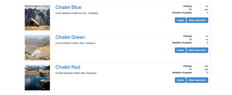
Default resource list view with the Bootstrap scheme. You can fully customize this and the other view by modifying the template while using bootstrap-specific classes.
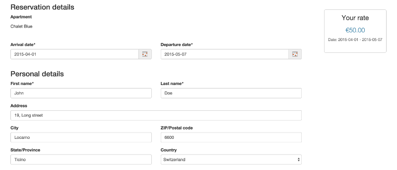
Default reservation form view with the Bootstrap scheme. As you see, the form also uses bootstrap classes for the form items.
If you want to use a different responsive framework than Bootstrap, with no default scheme, you'll need to start with e.g. the Bootstrap scheme, then click on Customize responsive CSS framework classes/tags and replace the bootstrap elements/classes with the ones used by your framework. You can also use this page to modify the bootstrap classes, for example if you'd like to change the widths used by default by specific form sections.
Note that selecting a new scheme will override your existing templates (Settings / Templates). This is why when selecting a new scheme planyo sends a backup of the previous scheme to your browser. This way you can always go back to your previous scheme and templates, or you can individually restore a single template from your backup.
Note: when choosing the Bootstrap scheme, it's better if your website already includes this framework (javascripts, css stylesheets, doctype, viewport meta tag). Planyo will include the framework CSS for you if it detects that bootstrap is missing but there will be a short (1-2 sec) flash each time a template is loaded, so it's much better if Bootstrap is already included.
If you'd like to use the bootstrap scheme but don't yet have it included in your website, you use the following code as the base for a basic bootstrap-based webpage (the important tags are marked in red):
<!DOCTYPE html>
<html>
<head>
<meta charset="utf-8">
<meta name="viewport" content="width=device-width, initial-scale=1">
<link rel="stylesheet" href="https://maxcdn.bootstrapcdn.com/bootstrap/3.2.0/css/bootstrap.min.css">
<script src="https://ajax.googleapis.com/ajax/libs/jquery/1.11.1/jquery.min.js"></script>
<script src="https://maxcdn.bootstrapcdn.com/bootstrap/3.2.0/js/bootstrap.min.js"></script>
</head>
<body>
<div class="container">
<!-- insert the contents including the planyo code here -->
</div>
</body>
</html>
You can read more about bootstrap on their official website.
You can see a demo using the bootstrap scheme here
If you'd like to customize the design used by the bootstrap scheme, see this tutorial.
If you want Planyo to use the responsive, mobile-first framework Bootstrap, you'll need to go to Site settings / CSS style editor and change your scheme to Bootstrap. When you do this, all your templates and the stylesheets will be modified to be Bootstrap-ready. Also, the booking form and other forms will also generate responsive (Bootstrap-based) code, so that the planyo-generated content will have the exact same look&feel as the rest of your Bootstrap-based website. Feel free to further customize the look&feel, both in the CSS style editor page, and by modifying the templates.
Default resource list view with the Bootstrap scheme. You can fully customize this and the other view by modifying the template while using bootstrap-specific classes.
Default reservation form view with the Bootstrap scheme. As you see, the form also uses bootstrap classes for the form items.
If you want to use a different responsive framework than Bootstrap, with no default scheme, you'll need to start with e.g. the Bootstrap scheme, then click on Customize responsive CSS framework classes/tags and replace the bootstrap elements/classes with the ones used by your framework. You can also use this page to modify the bootstrap classes, for example if you'd like to change the widths used by default by specific form sections.
Note that selecting a new scheme will override your existing templates (Settings / Templates). This is why when selecting a new scheme planyo sends a backup of the previous scheme to your browser. This way you can always go back to your previous scheme and templates, or you can individually restore a single template from your backup.
Note: when choosing the Bootstrap scheme, it's better if your website already includes this framework (javascripts, css stylesheets, doctype, viewport meta tag). Planyo will include the framework CSS for you if it detects that bootstrap is missing but there will be a short (1-2 sec) flash each time a template is loaded, so it's much better if Bootstrap is already included.
If you'd like to use the bootstrap scheme but don't yet have it included in your website, you use the following code as the base for a basic bootstrap-based webpage (the important tags are marked in red):
<!DOCTYPE html>
<html>
<head>
<meta charset="utf-8">
<meta name="viewport" content="width=device-width, initial-scale=1">
<link rel="stylesheet" href="https://maxcdn.bootstrapcdn.com/bootstrap/3.2.0/css/bootstrap.min.css">
<script src="https://ajax.googleapis.com/ajax/libs/jquery/1.11.1/jquery.min.js"></script>
<script src="https://maxcdn.bootstrapcdn.com/bootstrap/3.2.0/js/bootstrap.min.js"></script>
</head>
<body>
<div class="container">
<!-- insert the contents including the planyo code here -->
</div>
</body>
</html>
You can read more about bootstrap on their official website.
You can see a demo using the bootstrap scheme here
If you'd like to customize the design used by the bootstrap scheme, see this tutorial.